
A portfolio can contain excellent photographs and still leave a visitor uncertain about the photographer. One frame offers a dramatic coast, the next a delicate portrait, the next a distant animal. Each succeeds individually. Together, they may answer only the question of where the photographer has been.
A memorable portfolio gives the viewer something more specific to recognize: a way of arranging space, an interest sustained across several pictures, or a consistent sensitivity to people and place. Building that impression requires selection. The challenge is deciding which good photographs belong to the work you want others to remember.
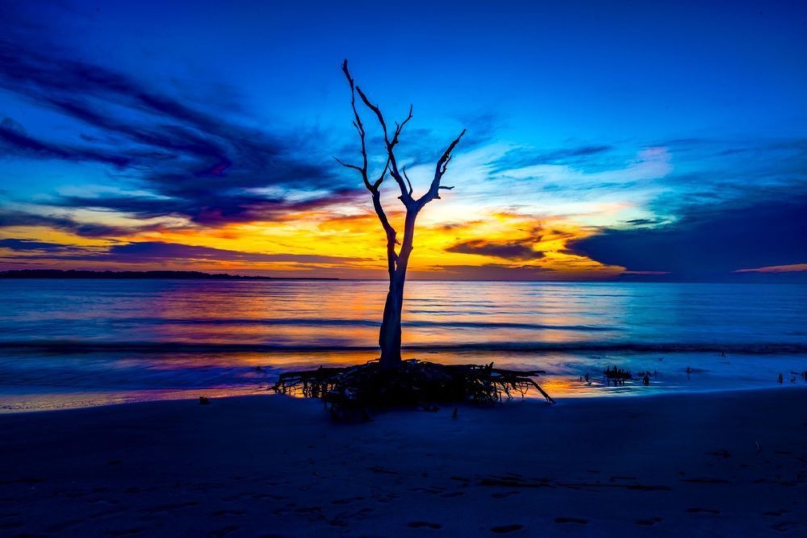
Opening photograph: Golden Driftwood, Boneyard Beach, Florida, by Neal Nachman / Artistic Creationz. The dark foreground branches and warm reflected light provide a concrete example of relationships that can recur across a body of work.
Choose the audience before choosing the images
A collection for a fine-art print buyer serves a different purpose from a portfolio aimed at an editorial picture editor. The first may emphasize a group of images that can be lived with and displayed together. The second may need to demonstrate observation, accurate context, and the ability to sustain a story.
Write one sentence describing the intended viewer and the decision you want to help them make. For example: “This portfolio shows an editor how I photograph coastal communities through people, work, and environment.” That sentence becomes a useful test when a beautiful but unrelated image competes for space.
You can serve more than one audience without forcing every photograph into the same sequence. Separate clearly named projects or galleries give visitors a way to understand the range. The organizing principle should be apparent before anyone has to read a long biography.
Look for habits already present in your work
A visual signature usually becomes clearer through close editing than through applying the same preset to every file. Review a broad selection of your photographs and look for recurring decisions. Perhaps you leave generous space around a subject, seek layered backgrounds, or return to the meeting of built structures and natural forms.
Include older work in this review. Recent photographs have the advantage of novelty, while a long-favored image may benefit from emotional attachment. Viewing both together can reveal a direction that is more durable than either feeling.
In Golden Driftwood, a sweeping dark branch organizes the foreground around a luminous ocean. The visual interest comes partly from the relationship between a strong silhouette and a bright open area. That observation is more useful as an editing criterion than a vague instruction to include more impressive sunsets.
Use differences to test cohesion

Compare that coastal frame with Emerald Winter. The Lake Tahoe photograph has a different palette, terrain, and spatial scale. Dark foreground trees lead toward open blue water, an island, and a distant mountain edge. The two images need not match in color to offer a meaningful visual conversation.
That does not mean they automatically belong beside each other in every portfolio. In a tightly defined Boneyard Beach project, the Tahoe image would interrupt the subject. In a broader landscape collection concerned with foreground structure and luminous distance, the relationship may justify its inclusion.
Context decides. Cohesion can arise through subject, visual treatment, geography, or an underlying question. Choose which connection matters for a particular collection and make the edit serve it consistently.
Give every photograph a job
Begin with a generous working selection, then write a short note beside each image describing its contribution. One establishes scale. Another shows an intimate detail. A third introduces a different mood. If several notes say essentially the same thing, you may have several photographs competing for one position.
When choosing between similar frames, judge them at the size and in the format a visitor will actually see. A tiny difference that matters at full resolution may have little effect on a web page. A clearer gesture or cleaner outline may be more valuable than marginal technical superiority.
For an initial edit, a dozen or so images can be a useful working limit, although the right number depends on the project. A limit forces decisions. It should not become a reason to add weak work merely to reach a target or remove necessary context from a substantial story.
Build a sequence with movement
An opening image should invite attention and represent the work that follows. If it promises a quiet observational project, the next pictures should develop that promise. An exceptional but unrepresentative opener can make the rest of a collection seem like a change of subject.
Vary distance, density, and rhythm where the material supports it. A broad landscape followed by a closer study gives the eye a different task. Several equally dramatic images placed together may reduce each other’s impact because there is no pause or change of scale.
Try removing a photograph and reading the sequence again. Sometimes its absence improves the surrounding images. Finish with a frame that feels intentional: an unresolved gesture, a quieter view, or a visual return to the opening. The last position deserves as much thought as the first.
Present the work with restraint
A portfolio website should make it easy to see photographs, understand projects, and find the photographer’s contact information. Descriptive gallery names help. A visitor should not have to guess whether an abstract title refers to landscapes, commercial work, or a personal series.
Use informative page titles, concise project introductions, and image descriptions that explain visible content. These support accessibility and help search engines understand the page. Repeating a string of keywords under every picture makes the presentation less useful to the person you hope to reach.
Check the collection on a phone as well as a larger screen. Watch for crops that remove the subject, captions detached from their images, and oversized files that slow viewing. Consistent presentation gives each photograph a fair chance without requiring identical aspect ratios or suppressing useful differences.
Ask for specific feedback, then edit again
Instead of asking whether someone likes the portfolio, ask what they remember after viewing it and which image feels least connected. Ask what kind of assignment or print collection they would associate with the work. Their answers reveal whether your intended message is reaching the audience.
Keep a record of the edit and revisit it when new work offers something the collection lacks. A new photograph earns its place by improving the whole, not simply by being recent.
A visual signature becomes convincing when a viewer can recognize a sustained set of choices across different situations. The portfolio is where you make those choices visible. Its strength comes from the care with which the photographs speak to one another.
Photographic examples: Artistic Creationz. All three photographs are credited to Neal Nachman. Neal is also the publisher of Shutterbug News; the portfolio is used here as an affiliated visual example. The compositional interpretations are editorial analysis.